Below are examples of magazine covers and contents pages that i am taking inspiration from for my prelim.
This is a contents page to NME and i like it because it uses a house style which involves yellow and black to highlight key articles in the magazine, the colour scheme does not match the front cover but this suggests that the page is about a different band to the band shown on the front. The size of the image is in correlation with the importance of the topic on the page, for example: the biggest images is on the left which indicates that it is the main story on the page and the details of where to find the story are found at the top right corner. I like all these features because they are simple and easy to understand.

On this front cover the main mast is the title of the magazine "Kerrang!" and the main sell line for this magazine is the band "Metallica" and you can tell this because it has their name in big bold red text and an image of them behind it. Posters and exclusive stories are also sell lines on this front cover. The house style for this magazine consist of 3 colours: Black, red and white with straight bold text. I like the layout of this page because the colours are used appropriately to match the theme of a band and the magazine which works well.

On the front cover the main mast is the title of the magazine, "NME" and the main selling line is "Beady Eye" and you can tell this because the name of the band is in big white bold writing with a catch line above it with a medium close up of the band themselves. This edition of the magazine is a Christmas one and you can see this because extra sell line's are in Christmas decoration shapes and the main mast has a snow pattern on the top of it, which is the main theme for Christmas. I chose this cover because it was useful inspiration for a seasonal addition of a magazine.
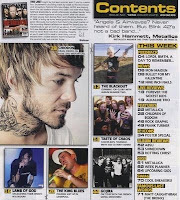
This content page uses 3 main colours to match the house style and one extra colour to advertise a separate subscription item, the main colours are black, white and red. This contents page also uses banners to split features up into separate section's. Another thing which is good about this contents page is the A-Z band index, its easy to read and in a useful place because it doesn't take up a lot of space but just enough to be noticed.


 On this front cover the main mast is the title of the magazine "Kerrang!" and the main sell line for this magazine is the band "Metallica" and you can tell this because it has their name in big bold red text and an image of them behind it. Posters and exclusive stories are also sell lines on this front cover. The house style for this magazine consist of 3 colours: Black, red and white with straight bold text. I like the layout of this page because the colours are used appropriately to match the theme of a band and the magazine which works well.
 This content page uses 3 main colours to match the house style and one extra colour to advertise a separate subscription item, the main colours are black, white and red. This contents page also uses banners to split features up into separate section's. Another thing which is good about this contents page is the A-Z band index, its easy to read and in a useful place because it doesn't take up a lot of space but just enough to be noticed.


