Sunday 15 April 2012
Evaluation Question 7 - Looking back at your preliminary task (the school magazine), what do you feel you have learnt in the progression from it to the main task?
Through my progression from the preliminary task to the main task, I feel as if I have learnt how to effectively design a proffessional product. I believe this because after comparing my two products I am able to see that after research I was able to identify the key features of a proffessional magazine e.g. the colour scheme, setting of photoshoots and model selection. I have also learnt how to manage my time more effectively and to meet deadlines.
Friday 13 April 2012
Evaluation Question 6 - What have you learnt about technologies from the process of constructing this product?


Some other technologies I used to create my magazine consist of websites such as www.blogger.com to store my work. Another reason why I used blogger is because it is an easy way to access my coursework anywhere which makes it ideal to do work in various locations, Blogger is also an appropriate website to store my work on because it acts as an online journal, recording any developments I have made throughout the course and the work I produce is ordered chronologically which means the website makes my work easy to navigate and allows me to edit any old pieces of work that would normally take a long time to find.
Other software I used consists of websites such as www.goanimate.com to create a simple animation in my evaluation question 5 to show the feedback I got from people, slideshare (to convert my power points to online documents), www.Olioboard.com to create the mood board below which is to show what pieces of equipment I have used to make my products. I also used simple pieces of software such as Microsoft Word and Microsoft Powerpoint. I used these because I have been familiar with these programs for a number of years meaning that my experience with these programs have developed and I am able to use them extensively and effectively. I used powerpoint to create my evaluation question 7 and 3, I did this because I believe that they were the most effective way to answer the questions. I also used www.prezi.com to answer evaluation question 1 to show the similarities and differences between my product and a professional product. Another reason I believed Prezi to be appropriate for this course because it was an effective way to plan the creation of my product e.g shooting days, shooting locations and models etc. I believe my skills have developed in using prezi because I am able to easily navigate the website and create an effective mind map. I used www.pixton.com to animate an explanation of what the production process my magazine would go through if it were to be made as a professional product, the reason I did this is because I believe the website is a fun and simple way to explain a point. The pieces of hardware I created consists of a Tripod, Mac, Camera and various props.

Thursday 29 March 2012
Evaluation Question 5 - How did you attract/address your audience?


For my double page spread, I took inspiration from the primary research into similar products that I conducted at the start of my project. I took a similar styled magazine and analyzed the spread, noticing that even if the article only takes up two thirds of one page, there's still plenty of content to attract the audience (images). I thought this design would attract my audience due to the targetted audience being teenagers, I figured they would not want to be reading masses of article content and would enjoy reading it leasurely meaning less article content is neccessary. To disguise the small article I incorporated images and quotes similar to that of a "My Chemical Romance" article in a Kerrang! magazine.
I conducted a piece of written research and got feedback from five students and asked them what attracted them to my product and what was good about it overall, the following animation is a recording of the findings:
Like it? Create your own at GoAnimate.com. It's free and fun!
Monday 26 March 2012
Evaluation Question 4 - Who would be the audience for your media product?
Following secondary research in the initial stages of my project, I found that the audience from magazines such as NME, Mojo and kerrang are generally teenagers. I then conducted my primary research which suggested the audience to be teenagers all interested in similar styles and designs which lead me to the conclusion that my audience is aimed at teenagers who are "Indie". I set about this by follow the trends portrayed in big successful magazines and took inspiration from them.


Saturday 24 March 2012
Friday 23 March 2012
Evaluation Question 2 - How did you represent social groups?
In my media product I have tried to represent the "Indie" stereotype, which are often portrayed in magazines such as Kerrang!, NME and MOJO. This is because these three magazine represent the music genre "Indie rock 'n' roll" effectively, in that the styles of the magazine match this particular stereotype i.e the models, costumes, font, colours and layout.
"Indie" people are generally recognized as people who wear soft toned clothes such as red, navy blue, mustard, maroon, black or white. They also tend to keep clothes basic and not "flashy". So baggy shirts, polo shirts, jeans, chinos and cardigans all fit the genre and their overall stance is seen to be laid back. They are also seen as people who enjoy classic icons (that tend to be based in Britain) such as vinyl's, classic mini coopers, red telephone boxes, red London buses and "artistic" pictures which means they can be seen as random.
Throughout this genre, male's are seen to be the dominant gender and are seen more often than females. Throughout my research I looked into the front covers of indie magazines and checked to see what gender the front cover models were, the majority of them are male's which is what I decided to do with my magazine.
In terms of the genre itself, Indie styled people and music tend to deviate from its origin "rock", in that the music uses the same instruments yet the music is slower and calmer.
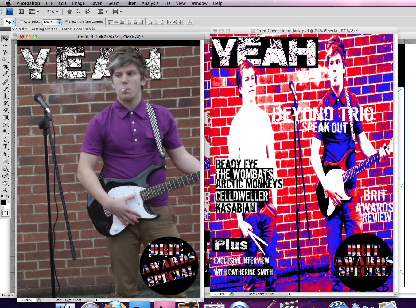
Throughout my product I have successfully been able to replicate the Indie genre through the choice of my models, costumes, settings and props. I did this through using an Indie colour scheme (Purple and mustard on one model and white with mustard on the other, with the front cover being against a red brick background). I've used a single male model on the front cover to illustrate the male's dominance throughout the genre. I have also done this by having the models eye line high up on the photo along with his eyes being distant from the magazine focus itself.
"Indie" people are generally recognized as people who wear soft toned clothes such as red, navy blue, mustard, maroon, black or white. They also tend to keep clothes basic and not "flashy". So baggy shirts, polo shirts, jeans, chinos and cardigans all fit the genre and their overall stance is seen to be laid back. They are also seen as people who enjoy classic icons (that tend to be based in Britain) such as vinyl's, classic mini coopers, red telephone boxes, red London buses and "artistic" pictures which means they can be seen as random.
Throughout this genre, male's are seen to be the dominant gender and are seen more often than females. Throughout my research I looked into the front covers of indie magazines and checked to see what gender the front cover models were, the majority of them are male's which is what I decided to do with my magazine.
In terms of the genre itself, Indie styled people and music tend to deviate from its origin "rock", in that the music uses the same instruments yet the music is slower and calmer.
Throughout my product I have successfully been able to replicate the Indie genre through the choice of my models, costumes, settings and props. I did this through using an Indie colour scheme (Purple and mustard on one model and white with mustard on the other, with the front cover being against a red brick background). I've used a single male model on the front cover to illustrate the male's dominance throughout the genre. I have also done this by having the models eye line high up on the photo along with his eyes being distant from the magazine focus itself.
Tuesday 20 March 2012
Thursday 15 March 2012


Monday 12 March 2012
Double Page Spread Construction
 |
| This is my half completed double page spread, these is a bit of article content missing and two photos. I decided to use this layout because it looks simple but professional and the layout is not confusing for readers to understand. |
Tuesday 21 February 2012
Constructing My Front Cover
 |
| This is the template I will be using to construct my front cover for my magazine, to create a professional look on the final product. |
 |
| This is my first edit for magazine cover, it is not the final edit because it is too dark which does not create a professional appeal. |
 |
| A potential first draft of the front cover. A four tone gradient effect is used present the colours of the union jack, due to the magazine being based on the "Brit Awards". |
 |
| I decided to cut the left model out because the photo taken was a portrait photo when it needed to be landscape, this was a problem because it meant the image had to be stretched which gave it an unoriginal look. |
Action Plan
You should start this week with a progress update post. In this post you should include the following:
There are 6 weeks until the Easter break which means - 6 weeks of lesson time to complete my foundation portfolio.
There are 60 marks available for construction and 20 marks for Research and Planning and 20 marks for evaluation - 100 marks in total
To achieve a grade:
A I need to get 80 marks
B I need to get 70 marks
C I need to get 60 marks
To be in level 4 (grade A/B) my work must demonstrate excellence throughout.
By Monday 5th March I should have a rough cut of my products
By Monday 19th March my products should be completed
From Monday 19th - Friday 30th March I will be working on my 7 evaluation questions.
The my completed portfolio should be submitted for formal marking on Monday 16th April. I should use the Easter break to make any minor amendments to my work.
In order to meet these deadlines I will: Organise my time effectively and make sure all pieces of work are up to the highest standard possible.
Wednesday 15 February 2012
Article Draft
The music world was rocked when everyone heard about Beyond Trio’s problems as
a band when the lead singer David was kicked out the group, leaving their future a mystery! But now, guitarist Ben Sadler and drummer Luke Robinson have officially announced they’ve been on a hunt for a singer to replace David. Despite the band currently being split they were able to win an award for best international band for this year. I was able to get the current band members thoughts in an interview.
So what happened with the band? Why did David have to leave?
Basically what happened was, he got selfish, he began taking credit for everything we did, pushing Luke and me to the shadows, he also became really…condescending Once when his assistant didn’t carry his bag for him, he completely flipped and was in a bad mood for the rest of the day. We just couldn’t deal with his shit anymore so we forced him to leave.
(Ben Sadler, Guitarist)
Does Beyond Trio have a future in music? What will you do for a singer?
Oh definetely, we’re not going anywhere just yet. We’ve still got a few tricks up our sleeve. As for a singer we’re not sure what to do, we’ve got a few ideas as to who we want to lead the band in future but nothing definate, we sent out an audition or competition and we posted it on all our social network site’s so twitter, facebook and myspace and its for people who want to take on the role of lead singer and we got literally thousands of email responses. We’ve narrowed it down and should be revealing the new lead singer in the near future.
(Luke Robinson, Drummer)
At the Brit Awards, what was it like being with David again?
Erm it was alright, we still talk a lot but not nearly as much as we used to. We still miss him as part of the band because it’s not longer the original and i know we’ve had our arguements but when we won the award we ignored our issue’s because winning the best international band award is just so huge, I still can’t believe it. I’m sure none of us can.
(Luke Robinson, Drummer)
Your contract ended with Domino so your no longer with a record company, what will you do about that?
Well we were thinking of starting our own company, not only for our benefit but for other upcoming artists, we’ve always wondered how well we’d do at producing other artists music as well as creating our own. We’ve not had any finalised idea’s since our band is in trouble as it is, we wouldn’t be able to handle the pressure of both right now but i guess we’ll just see what happens in the future.
(Ben Sadler, Guitarist)
Saturday 11 February 2012


Friday 10 February 2012
Moodboard

This is my moodboard which includes a variety of different items that have given me ideas as to what to base my magazine on and what the content should involve along with what the models will be wearing and how they are standing.
Tuesday 7 February 2012
Costumes and props
 |
| This is the band logo I have created with a font that was downloaded from a site with no copyright's on the font itself and I created the image from scratch using pain to create the initial triangle then photo shop to add the shining effect. I decided to design it like this because I thought it was realistic and a band could possibly use this as their actual logo. |
 |
| I decided to use this combination of clothes because it has a classic look about it due to the contrast of colours. I also decided to use them because it fits well with the targeted genre therefore appealing to the target audience. This outfit will be model number 1's (smoking and holding the guitar). |
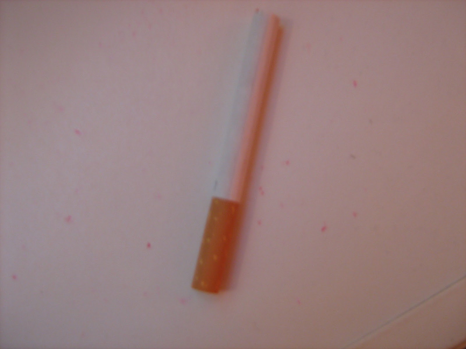 |
| i decided to include a cigarette as a prop because it has a cool and laid back appearance to it and throughout conducting my research i noticed many artists were smoking in their photos meaning that smoking seems to be a stereotypically indie styled thing to do. |
 |
| I am using these clothes as a costume because they look similar to model 1's clothes but less colourful because he will be sat behind a set of drums therefore his clothes won't ne noticable, making having colourful clothes useless. I picked similar trousers to show the union between the remaining two band members. |
 |
| I chose to use these clothes for the female model because it is stereotypically what an "indie" girl would wear and due to the lighter shading of colours, it indicates a light-hearted article based around that model. |
 |
I decided to include this guitar as a prop for my magazine because it is a big musical symbol and it fits the target genre meaning it will appeal to the target audience because of it's flashy, eye-catchy appearance. |
 |
Similarly to the guitar, drumsticks are a musical symbol which implies what the magazine is all about. It also indicates the type of band's that will be included in the magazine due to it being a prop for the main cover and double page spread. |
 |
| I decided to use a microphone as a prop despite it not neccessarily being needed because it fits in well with the guitar and drumsticks and it's a vital part of the magazine because the article is based around a singer. |

Monday 6 February 2012
Flat Plans Re-vised
Front Cover:
For my front cover i decided to change the house style to more neutral colours (blue and black) to maintain a sense of professionalism and maturity, matching the target audience. I also decided to move the main image to the middle and surround it in sell lines because that is the general look of all magazine covers i have researched it and brings the attention to the microphone in the middle and makes readers wonder why it's there if nobody is placed behind it which is a key element I want for my magazine.

Contents Page:
I made no further improvements to my contents page other than the colour scheme therefore i found there to be no need for further improvement. I decided to replace the clashing orange and blue style with a neutral black and blue house style.

Double Page Spread:
For my double page spread I had to come up with ways in which i could make the article look more interesting, one key idea I had was slice off the edge of the article box and put the band logo in the triangular space at the bottom, I decided this would be an interesting twist to add because captures the readers attention on the logo. I also decided to use borders around the images to brighten up the page and make it more colourful. I placed a quote on the main image because it personalizes the the article more and draws readers in because it's the first thing they will notice on the page.

For my front cover i decided to change the house style to more neutral colours (blue and black) to maintain a sense of professionalism and maturity, matching the target audience. I also decided to move the main image to the middle and surround it in sell lines because that is the general look of all magazine covers i have researched it and brings the attention to the microphone in the middle and makes readers wonder why it's there if nobody is placed behind it which is a key element I want for my magazine.
Contents Page:
I made no further improvements to my contents page other than the colour scheme therefore i found there to be no need for further improvement. I decided to replace the clashing orange and blue style with a neutral black and blue house style.
Double Page Spread:
For my double page spread I had to come up with ways in which i could make the article look more interesting, one key idea I had was slice off the edge of the article box and put the band logo in the triangular space at the bottom, I decided this would be an interesting twist to add because captures the readers attention on the logo. I also decided to use borders around the images to brighten up the page and make it more colourful. I placed a quote on the main image because it personalizes the the article more and draws readers in because it's the first thing they will notice on the page.
Friday 3 February 2012
Planning an article
The Article:
About a band who has recently lost their lead singer over an argument between the guitarist and drummer and the singer because of their cocky attitude and claiming everything was his idea, due to this the two other members decided to cut him off from the band and are now on a search for a new singer, they have a few ideas as to who will be their new singer but nothing definite. The article is a Interview based article to make the content seem genuine and realistic
Style:
The article will be written in a third and first person perspective (third being the interviewer and first being the band members)
Beginning:
For the opening paragraph I will be generally setting the scene and giving a brief summary that the band is currently in. I will make certain points appear more important by highlighting them with a bold colour, I shall do this throughout the article and not just the introduction.
Content:
I will be focusing the article mainly on the band's hun for a new lead singer but also on their win for best new band despite their singer no longer being there, but he was there to accept the award with the two remaining members along with their thoughts on that.
Wednesday 1 February 2012
Image Analysis & Composition

- Four separate images, all look similar, To show a mixture of emotions that are being conveyed through this photo.
- His eyes are never directly exposed to the camera, implying that he has something to hide
- All shots are close up's/medium-close up's to show personal emotion
- the word "love" written across one of his hands, this gives an indication as to what the following article is about or the implication that the image is showing a man's struggle with love
- In black and white to provide an empty and dull look to provide a sad atmosphere
- Each image represents a different perspectives, the first being oblivious, the second being pain, the third being anger and the fourth being closeness.

- Medium close up shot in a dark environment with a small light in the background, perhaps to imply that in every time of sadness there's always some happiness. The Medium close up shot allows us to see who this person is and we can make first impressions as to what he is like.
- His eyes in the upper third of the shot but are looking down, not directly at the camera, perhaps to show that he should be in a state of higher power but feels equal to those below him, maybe to show isolation
- The clothes he wears shows a basic style
Tuesday 31 January 2012
Peer assessment of flat plans and idea's
Peer Feedback
- Re-think house style because of so many clashing colours, may turn into a put off. Only include two colours that clash to create a unique selling point to draw in my target audience.
- Work on layout of double page spread because it looks boring on my flat plans. It needs to look interesting to match my target audience which ties in with the mark scheme because it says that the magazine needs to appeal to the target audience.
- Re-draft front cover because the image is too far to the left and all the writing is on the right therefore it looks less professional than if i was to move the image to the middle. I also need to evaluate the font size of each sell line to make the importance of each one obvious.
- Originally i used clashing colours such as orange/blue, red/green and yellow/purple. Due to the feedback i was given about them i have decided to use colours that don't clash but do appear striking to the reader such as black/red or blue/white.
- On my double page layout I have decided to move one of the images into the main article column and put the other two images on an angle to create a fresh and exciting appeal to the readers.
- By strategically placing the image in the middle and surrounding it in sell lines (including the main one), the level of professionalism will improve which relates to the mark scheme because it states the magazine needs to look like it was created to a professional level.
Flat Plans
Front Cover:
On the front cover i decided to name the magazine "Yeah!" because it indicates the simplicity the magazine has to offer and attracts the audience through the use of "!" because it makes the overall name stand out more. I also used a clash of colour's to create an unusual appeal that matches the music genre. I made the sell lines look more interesting by putting them on a tilt, this makes it catchy to the eye because of the mixture of bold vibrant colours and the unusual placing of sell lines, however through doing this I believe the sense of professionalism is lost, I think i can fix this by re-thinking the house style. For the main image I decided to use two models and leave a space for a third model, this is because I find three models to be the most appealing because it fills the page nicely, not making it too over crowded or leaving it empty and in leaving an obvious space for a third model I believe it draws the audience in because it makes them wonder as to where that model/band member is.

Contents Page:
For the contents page i decided to keep it simple so readers can navigate it easy enough, with three images in the middle and contents lists down either side I believe that this page is a near on professional styled page. I based this page off one of NME's contents pages because i believed it looked appealing due to the simplicity. I decided to use an A-Z of bands because it narrows down searches if you want to find things out about a certain band and not just the music genre overall.

Double Page Spread:
For my double page spread i found it to be one of my weak points, but i thought that maintaining a basic layout was essential so i decided to use the left hand side for images and the right hand side for the main story, however in doing this it has made the page look dull therefore revising the layout is essential for creating one accurate to a professional standard and to interest the readers of my magazine

On the front cover i decided to name the magazine "Yeah!" because it indicates the simplicity the magazine has to offer and attracts the audience through the use of "!" because it makes the overall name stand out more. I also used a clash of colour's to create an unusual appeal that matches the music genre. I made the sell lines look more interesting by putting them on a tilt, this makes it catchy to the eye because of the mixture of bold vibrant colours and the unusual placing of sell lines, however through doing this I believe the sense of professionalism is lost, I think i can fix this by re-thinking the house style. For the main image I decided to use two models and leave a space for a third model, this is because I find three models to be the most appealing because it fills the page nicely, not making it too over crowded or leaving it empty and in leaving an obvious space for a third model I believe it draws the audience in because it makes them wonder as to where that model/band member is.
Contents Page:
For the contents page i decided to keep it simple so readers can navigate it easy enough, with three images in the middle and contents lists down either side I believe that this page is a near on professional styled page. I based this page off one of NME's contents pages because i believed it looked appealing due to the simplicity. I decided to use an A-Z of bands because it narrows down searches if you want to find things out about a certain band and not just the music genre overall.
Double Page Spread:
For my double page spread i found it to be one of my weak points, but i thought that maintaining a basic layout was essential so i decided to use the left hand side for images and the right hand side for the main story, however in doing this it has made the page look dull therefore revising the layout is essential for creating one accurate to a professional standard and to interest the readers of my magazine
Tuesday 24 January 2012
Primary Audience Research
I conducted some primary audience research in order to:


These are the products I did, with a selective sample from my target audience, I found that:
These are the questions I did:
- Find out what appeals to my target audience
- To discover any flaws or potential improvements that could be made to my magazine genre
- To identify any gaps in the market and place a refreshing new twist on the genre


These are the products I did, with a selective sample from my target audience, I found that:
These are the questions I did:
- What caught your eye first when you first looked at the front cover?
- Did you like the colours used? If so why? If not, why not?
- Did the find the main image on the front cover appealing? If so why?
- Why music genre appeals to you most?
- What are your 3 favourite things about this magazine?
- What 3 things would you do to improve this magazine?
- Did you find the contents page effective?
- Was the double page spread appealing enough to make you want to read on? If so why?
- Did you find the advertisements appealing? If so why?
- Overall, out of 10, how much would you give this magazine?
In this video he noticed the red font first and noticed that all things that are important are also highlighted in red. This has given me good feedback because it has given me an indication that if there are any important points in my magazine, perhaps highlighting them would be a good idea, found the red very appealing because it makes the magazine look passionate because that's one of the connotations of red along with insanity and blood. Listens to main stream chart music.
From this response I also found that the red was used effectively to highlight key areas. Main image appealing because it consists of very abstract props such as a pocket watch, walking stick and top hat which can be seen as unusual for a modern rock band to use. A mixture of music appeals to her, generally pop and chart music but also a bit of Indie/Niche music too.
Also found the red used to be appealing, dangerous and bold. Noticed the red first before anything else and thinks the red connotates the danger and excitement of the band Kasabian on the front cover which is exactly what the magazine intended because they described the new album as "dangerous". Double page spread needs more writing on it because it doesn't have enough to cover a story so in my magazine, plenty of content is essential. The contents page was described to be "easy to navigate" which is good feedback because I can take influence from it and use similar traits in my contents page.
Subscribe to:
Posts (Atom)