Welcome

Welcome. This my AS Foundation Portfolio blog. Here you will find research and planning, construction evidence and evaluation for my coursework project. Peace out.

Tuesday 21 February 2012

Constructing My Front Cover

This is the template I will be using to construct my front cover for my magazine, to create a professional look on the final product.
This is my first edit for magazine cover, it is not the final edit because it is too dark which does not create a professional appeal.
A potential first draft of the front cover. A four tone gradient effect is used present the colours of the union jack, due to the magazine being based on the "Brit Awards".
I decided to cut the left model out because the photo taken was a portrait photo when it needed to be landscape, this was a problem because it meant the image had to be stretched which gave it an unoriginal look.

Action Plan

You should start this week with a progress update post. In this post you should include the following:

There are 6 weeks until the Easter break which means - 6 weeks of lesson time to complete my foundation portfolio.

There are 60 marks available for construction and 20 marks for Research and Planning and 20 marks for evaluation - 100 marks in total

To achieve a grade:

A I need to get 80 marks

B I need to get 70 marks

C I need to get 60 marks


To be in level 4 (grade A/B) my work must demonstrate excellence throughout.

By Monday 5th March I should have a rough cut of my products

By Monday 19th March my products should be completed

From Monday 19th - Friday 30th March I will be working on my 7 evaluation questions.

The my completed portfolio should be submitted for formal marking on Monday 16th April. I should use the Easter break to make any minor amendments to my work.

In order to meet these deadlines I will: Organise my time effectively and make sure all pieces of work are up to the highest standard possible.

Wednesday 15 February 2012

Article Draft

The music world was rocked when everyone heard about Beyond Trio’s problems as
a band when the lead singer David was kicked out the group, leaving their future a mystery! But now, guitarist Ben Sadler and drummer Luke Robinson have officially announced they’ve been on a hunt for a singer to replace David. Despite the band currently being split they were able to win an award for best international band for this year. I was able to get the current band members thoughts in an interview.

So what happened with the band? Why did David have to leave?

Basically what happened was, he got selfish, he began taking credit for everything we did, pushing Luke and me to the shadows, he also became really…condescending Once when his assistant didn’t carry his bag for him, he completely flipped and was in a bad mood for the rest of the day. We just couldn’t deal with his shit anymore so we forced him to leave.  
(Ben Sadler, Guitarist)

Does Beyond Trio have a future in music? What will you do for a singer?

Oh definetely, we’re not going anywhere just yet. We’ve still got a few tricks up our sleeve. As for a singer we’re not sure what to do, we’ve got a few ideas as to who we want to lead the band in future but nothing definate, we sent out an audition or competition and we posted it on all our social network site’s so twitter, facebook and myspace and its for people who want to take on the role of lead singer and we got literally thousands of email responses. We’ve narrowed it down and should be revealing the new lead singer in the near future.
(Luke Robinson, Drummer)

At the Brit Awards, what was it like being with David again?

Erm it was alright, we still talk a lot but not nearly as much as we used to. We still miss him as part of the band because it’s not longer the original and i know we’ve had our arguements but when we won the award we ignored our issue’s because winning the best international band award is just so huge, I still can’t believe it. I’m sure none of us can.
(Luke Robinson, Drummer)

Your contract ended with Domino so your no longer with a record company, what will you do about that?

Well we were thinking of starting our own company, not only for our benefit but for other upcoming artists, we’ve always wondered how well we’d do at producing other artists music as well as creating our own. We’ve not had any finalised idea’s since our band is in trouble as it is, we wouldn’t be able to handle the pressure of both right now but i guess we’ll just see what happens in the future.
(Ben Sadler, Guitarist)

Friday 10 February 2012

Moodboard

This is my moodboard which includes a variety of different items that have given me ideas as to what to base my magazine on and what the content should involve along with what the models will be wearing and how they are standing.

Tuesday 7 February 2012

Costumes and props

This is the band logo I have created with  a font that was downloaded from a site with no copyright's on the font itself and I created the image from scratch using pain to create the initial triangle then photo shop to add the shining effect. I decided to design it like this because I thought it was realistic and a band could possibly use this as their actual logo.

I decided to use this combination of clothes because it has a classic look about it due to the contrast of colours. I also decided to use them because it fits well with the targeted genre therefore appealing to the target audience. This outfit will be model number 1's (smoking and holding the guitar).

i decided to include a cigarette as a prop because it has a cool and laid back appearance to it and throughout conducting my research i noticed many artists were smoking in their photos meaning that smoking seems to be a stereotypically indie styled thing to do.

I am using these clothes as a costume because they look similar to model 1's clothes but less colourful because he will be sat behind a set of drums therefore his clothes won't ne noticable, making having colourful clothes useless. I picked similar trousers to show the union between the remaining two band members. 
I chose to use these clothes for the female model because
it is stereotypically what an "indie" girl would wear and due to the
lighter shading of colours, it indicates a light-hearted article based around that model.


I decided to include this guitar as a prop for my
magazine because it is a big musical symbol and it fits the target
genre meaning it will appeal to the target audience
because of it's flashy, eye-catchy appearance.


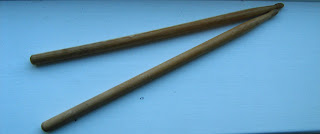
Similarly to the guitar, drumsticks are a musical
symbol  
which implies what the magazine is all about. It also indicates the
type of band's that will be included in the magazine due
to it being a prop for the main cover and double page spread.

I decided to use a microphone as a prop
despite it not neccessarily being needed because
it fits in well with the guitar and drumsticks and it's
a vital part of the magazine because the article
is based around a singer.

Recce


Monday 6 February 2012

Flat Plans Re-vised

Front Cover:
For my front cover i decided to change the house style to more neutral colours (blue and black) to maintain a sense of professionalism and maturity, matching the target audience. I also decided to move the main image to the middle and surround it in sell lines because that is the general look of all magazine covers i have researched it and brings the attention to the microphone in the middle and makes readers wonder why it's there if nobody is placed behind it which is a key element I want for my magazine.

Contents Page:
I made no further improvements to my contents page other than the colour scheme therefore i found there to be no need for further improvement. I decided to replace the clashing orange and blue style with a neutral black and blue house style.

Double Page Spread:
For my double page spread I had to come up with ways in which i could make the article look more interesting, one key idea I had was slice off the edge of the article box and put the band logo in the triangular space at the bottom, I decided this would be an interesting twist to add because captures the readers attention on the logo. I also decided to use borders around the images to brighten up the page and make it more colourful. I placed a quote on the main image because it personalizes the the article more and draws readers in because it's the first thing they will notice on the page.

Friday 3 February 2012

Planning an article

The Article:
About a band who has recently lost their lead singer over an argument between the guitarist and drummer and the singer because of their cocky attitude and claiming everything was his idea, due to this the two other members decided to cut him off from the band and are now on a search for a new singer, they have a few ideas as to who will be their new singer but nothing definite. The article is a Interview based article to make the content seem genuine and realistic

Style:
The article will be written in a third and first person perspective (third being the interviewer and first being the band members)

Beginning:
For the opening paragraph I will be generally setting the scene and giving a brief summary that the band is currently in. I will make certain points appear more important by highlighting them with a bold colour, I shall do this throughout the article and not just the introduction.

Content:
I will be focusing the article mainly on the band's hun for a new lead singer but also on their win for best new band despite their singer no longer being there, but he was there to accept the award with the two remaining members along with their thoughts on that.

Wednesday 1 February 2012

Image Analysis & Composition


  • Four separate images, all look similar, To show a mixture of emotions that are being conveyed through this photo.
  • His eyes are never directly exposed to the camera, implying that he has something to hide
  • All shots are close up's/medium-close up's to show personal emotion
  • the word "love" written across one of his hands, this gives an indication as to what the following article is about or the implication that the image is showing a man's struggle with love
  • In black and white to provide an empty and dull look to provide a sad atmosphere
  • Each image represents a different perspectives, the first being oblivious, the second being pain, the third being anger and the fourth being closeness. 
  • Medium close up shot in a dark environment with a small light in the background, perhaps to imply that in every time of sadness there's always some happiness. The Medium close up shot allows us to see who this person is and we can make first impressions as to what he is like.
  • His eyes in the upper third of the shot but are looking down, not directly at the camera, perhaps to show that he should be in a state of higher power but feels equal to those below him, maybe to show isolation
  • The clothes he wears shows a basic style